The Lagom LCD monitor test pages
This page in:
English | Nederlands | 中文(简体)
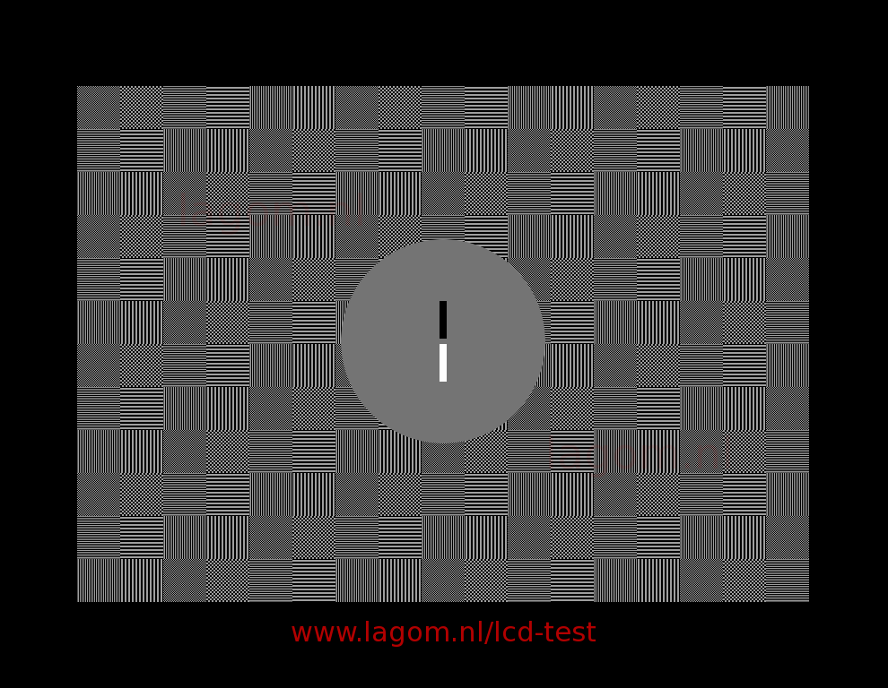
LCD monitors often have a "sharpness" control, which can emphasize or deemphasize boundaries between light and dark areas. Ideally, it does neither, unless you like a bit of fuzziness or like small letters to have more contrast. If the sharpness setting is correct (i.e., neutral), all blocks in the image below will blend in when you look at the screen from a distance or while squinting your eyes. If the gamma of your display is correct as well, then the central disc will blend in, but we will have a better look at this in the next test. If the sharpness setting is far off, you may be able to see fringes around the white and black bars in the center.
If your monitor is on a VGA cable, you should first make sure that the clock/phase settings are correct (see previous test). Your monitor must be running in its native resolution for this test and the image viewer must not resize the image to fit it on the screen.
The Sharpness setting can compensate for signal deterioration ("bandwidth loss") in VGA cables. The optimal setting could depend on the quality of the cable connection and variations in the electronics inside the monitor from one monitor to the next, and maybe even the quality of the video card. It is not clear to me what the purpose is of a sharpness setting on a monitor on a DVI connection. Apparently, it is to serve people who like a bit of fuzziness or added contrast in fine details such as those in small fonts, or, more likely, to impress potential buyers by making images appear sharper than they really are. Other information on the web:
In any case, if the sharpness setting is not correct, the gamma calibration test will not be meaningful. The sharpness test comes in two versions. The first variant ("DVI") is with vertical lines and fine checkerboard patterns. The second variant ("VGA") is with only horizontal lines, which should look better than the DVI version, even on monitors that are on a VGA cable. In principle, both versions should look good, even on a VGA connection.
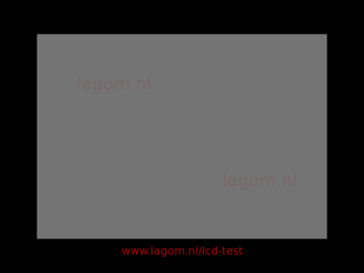
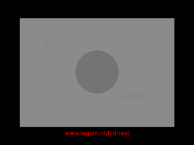
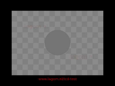
Here you see what the sharpness test image should look like when you squint your eyes: as a completely smooth grey rectangle. Maybe the squares blend in, but the central disc stands out, as below on the right. That means that the sharpness is perfect, but you need to change the display gamma using the gamma calibration test image
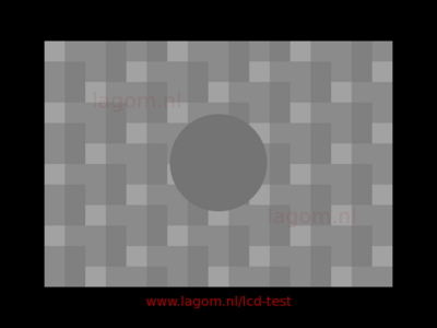
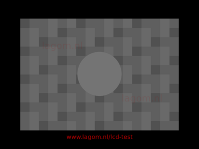
If the sharpness is too high, the test images will like this:
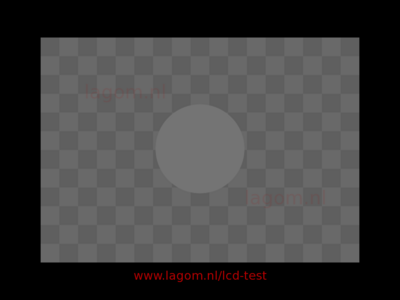
And if the sharpness is too low, it looks like this:
© Copyright Han-Kwang Nienhuys, 2008. The text and accompanying images may not be redistributed. This includes placing the images on other websites, either as a copy or through hotlinking. Read more...